Thank you to everyone that attended, participated in, and sponsored Design Works 2014 + Sustainability Forum + Annual Meeting. With over 160 attendees, the event was fabulous with many dames and gents donning their 1920’s garb while the drinks flowed freely.
Bill Eubanks presentation on Landscape Architecture and his thoughts on urban design were informative and enlightening. My personal favorite was his image showing how proper planning and streescaping can clean up a city by transforming it from a purely functional means of transportation from point A to B attracting street walkers and boozers, to a welcoming, clean, family friendly destination.
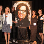
The special presentation by local Greenville artist Jared Emerson in honor of Suzanne Tick* was captivating as he painted with his hands and boogied down crafting a self portrait of Suzanne upside down in ten minutes without referencing her or a photo. If you didn’t see it, you missed an AMAZING performance.
*Suzanne won the IIDA Titan award in 2013. The Titan award is given to one individual, company, or organization annually who make a significant contribution to the field of interior design.
Congratulations to our scholastic award winner, Lindsey Gerlock from Anderson University.
Event Sponsors
Teknion, Tandus |Centiva
BIg Cheese:
Bentley
Bee’s Knees:
Amtico
Johnsonite
Maharam
Mannington Commercial
Sherwin Williams
Young Office
Cat’s Meow:
CH Briggs
Dan Lurie Associates, inc.
Daltile
DHA of the Carolinas
Interface
National
Residential Winner
Marquee Station Clubhouse
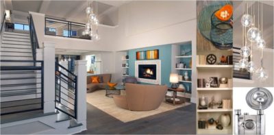 Located near an emerging technology center, and on the site of a Historic Drive In Theater, the design team’s goal was to respect the communities’ past, while recognizing the coming future. As a multifamily product, Marquee’s design needed to attract the targeted high demand talent of the local technology market, and be a desirable addition to the local rural community.
The Clubhouse offers many amenities of today’s tech office environment; casual social lounge areas, coffee café, modern fitness center, high speed audio visual equipment, all with ample access to daylight.
Bold Pop Art and classic modern furnishings coupled with warm accents create a space that is both energetic and inviting. Historic photos and playful vintage accessories in a modern floor plan bring an unexpected combination of tradition foiled against modern lines.
The Design Team integrated the design concepts of the amenity spaces with the Landscape Architecture and Building Architecture. As an integral part of the Project Team, The Interior Designers were instrumental in creating a consistent product brand for the Project. Interior Finishes and concepts were closely coordinated with the exterior Landscape, Exterior Building Materials and Signage Design; resulting in a successful product, the Client has successfully marketed to their customers.
Unbuilt Honorable Mention
Mount Sinai Doctors Faculty Practice
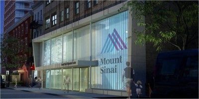 The Mount Sinai Doctor’s Faculty Practice repurposes a Depression Era parking garage on East 85th Street into physician office practices. Utilizing an off campus location allows the system to expand availability of services. Creative reuse through thoughtful design will transform this structure into a modern, cost effective solution challenges of current facilities environment. The plan is organized around a simple, compact core to maximize efficiency and future flexibility assist in way finding, and minimize construction costs. The interior design elements feature timeless, durable and neutral finishes. Accents of bold color assist way finding and offer visual interest, aesthetic diversity, and branding for individual tenants. The dynamic color scheme contrasts beautifully with the flood of natural light, elegant lines, and spatial organization of the building’s public areas. Contemporary exterior materials juxtaposed against the existing structure respect the historicity of the grand building while announcing entry.
Unbuilt Winner
The Duke Endowment
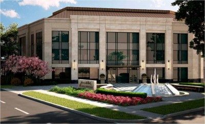 The new 45,000-square-foot headquarters for The Duke Endowment acts as a physical manifestation of the organization’s legacy and identity within the Charlotte community and the greater Carolinas region. Drawing from Mr. Duke’s intent for water power of the Carolinas to continually provide for its people, the focus on the water is a continuing theme throughout the new headquarters. The building echoes the strength, structure, and rigor of a dam as well as the circulation of a river to penetrate and weave throughout the building creating a seamless connection between the indoors and out.
Planned for LEED Silver, the building is purposefully sited to respond directly to solar orientation with its main entrance along the east-west axis to take advantage of day lighting conditions for occupants. To further promote reduced energy consumption, the use of LED light fixtures, a tight thermal envelope, and high controllability of systems reduces demand, while optimized mechanical systems keep energy performance efficient.
Regional prioritization around the use of products and materials sourced from the Carolinas or within 500 miles was important to the Endowment to continue its legacy to support the people and industry of the Carolinas. Major building materials including the granite, drywall, carpet and furniture was sourced from local North and South Carolina manufacturers.
Retail Winner
Charleston Cooks
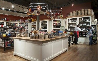 This new culinary arts retail/classroom prototype store has been a huge success. Located in a dynamic downtown city, this facility provides the space, tools and instruction with which foodies and wine enthusiasts can happily gather, taste and learn. With both demonstration and participation classes, beginners and experts alike can delve into an array of deliciousness, from savory sauces to wonderful wines. The instructional teaching kitchen offers tiered seating for 30 with a large center cooking island for gathering during cooking demonstrations. A palette of natural materials, combined with “cleaned-up” traditional forms, creates a comfortable shopping and learning environment and helps showcase the Owners brand and retail products. The adjoining retail store offers a plethora of equipment and gadgets to make the culinary magic happen for students returning home to practice their new culinary skills.
Hospitality Honorable Mention
Private Club
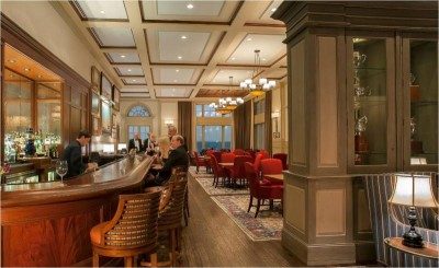 The renovation of a building originally designed as a Shrine Temple in the early 1960’s, was transformed into high-end Private Club. The aesthetic of the interior reflects the rich traditional heritage of the city, with traditional moldings, and other high-end finishes. The existing building interior did not take advantage of the extraordinary site and the beauty of the water views. This was rectified in the renovation with the addition of multiple expansive windows. Design inspiration drew from two rich sources: the southern traditional heritage and the maritime heritage. Maritime motifs such as those resembling rope, maritime maps, rich cobalt colored velvet drapes and custom wool rugs were woven into this rich tapestry. Custom decorative lighting was designed throughout the facility to also enhance the maritime theme. Cast iron with rope molding detailing was a unifying design element that tied the decorative lighting together.
Hospitality Winner
The Vue Sky Lounge
Tripp Beacham
Summer Salters
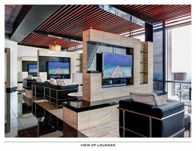 Visually striking. Exquisitely crafted. Thoughtfully functional. The idea behind this luxurious residential lounge was to embrace the breathtaking views of the city skyline while providing a variety of inviting lounge experiences that felt intimate yet visibly part of the whole open environment. The project began as shell space originally envisioned for two penthouse upfits. This created significant Mechanical Electrical and Plumbing issues as all infrastructure had to be rethought for the new use. Despite additional challenges of existing load bearing walls and low ceiling heights, the design creates a seamless flow between the trio of entertainment areas. This unity was crafted by incorporating rich cream tufted leather, elegant black granite and warm tiger wood planks throughout. The entire space evokes a dynamic, urban sophistication, dramatically different from day to night, enhanced by warm cove lighting and delicate fixtures that give an expressive contrast to the exposed concrete structure above.
Healthcare Honorable Mention
H. Filmore Mabry Center for Cancer Care
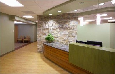 The Center was created to provide a healing environment that enhances patient well-being. To accomplish this goal, variation in each of the areas was created by providing spaces with more access to natural light and views to the outside. Additionally, we incorporated finishes that are more comfortable and familiar for patients, while also working to maintain the building’s high-tech design.
The chemotherapy suite utilizes volume and openness, while the spacious work area, with clerestory above, creates a pleasant work environment. The infusion bays and treatment rooms were reduced in scale by lowering the ceiling and providing partial height walls. Inside the Linear Accelerator Vault a soothing focal point in the ceiling was developed for patients to focus on during treatment.
Wood tones were used for the flooring and millwork. Soothing and natural tones, like green and beige were used on the walls along with natural stone.
Healthcare Winner
Arbor Acres Fitness Center Expansion
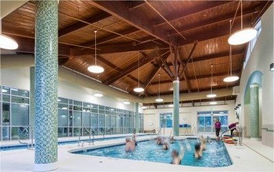 Originally constructed only as an indoor pool, this area no longer met the expanded concepts of wellness for the senior adults in this large continuing care retirement community.
The entrance for the new facility presented a dual opportunity to provide a new identity for the expanded wellness center, as well as an entrance lobby for the newly renovated residential building adjacent to it.
The existing pool was removed and replaced with three specific use pools: a two-lane lap pool, a warmer exercise pool, and a high-temperature jetted spa. Locker rooms were fully renovated and enhanced with additional showers.
The expansion provided space for a full cardio and resistance weight workout area, adjacent to a multipurpose room for fitness classes. A low-impact, 1/20th of a mile track encircles these two areas.
Government / Institutional Honorable Mention
Student Center Renovation
Optima Engineering, Kirkland Inc.
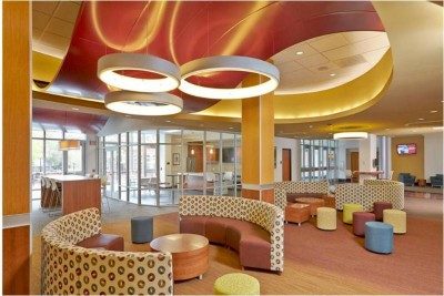 This renovation was programmed to promote greater use of the student center and foster collaboration among student groups. It includes shared offices, flexible spaces for small and large group meetings, and a multi-function kitchen. A variety of movable tables, chairs and lounge seating groupings are available to accommodate various meeting styles. Glass-front offices are distributed around the space.
Design focal points include a large oval form in the ceiling. This area highlights a large glass markerboard in the University’s gold, with the logo backpainted on the glass. Intersecting this feature is a “wave” ceiling in burgundy, another school color, extending into the hallway, which beckons students to enter and participate. Enclosed spaces have large scale monitors for student connectivity. The kitchen’s full slate of appliances enables groups to prepare and share meals during collaboration sessions. Large scale circular light fixtures create movement and an exciting space for inspiring ideas.
Corporate Honorable Mention
NASCAR Digital Media Group
Whitley Wood
John Gaulden
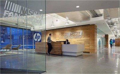 NASCAR needing a catalyst to re-energize their existing die-hard fan base, engage a new generation of fans, and continue to build their brand, turned to digital media to do it. Their decision to create a new internal digital media group, after previously outsourcing its digital media communications, created a shift in its culture. This shift fostered a new non-hierarchical Atmosphere encouraging fast collaboration and interaction across the entire space allowing content to go from idea to implementation within minutes. The image the client wanted this space to project was similar to the sport itself… fun, fast, exciting and passionate. People entering the space are not to be ‘wowed’ by expense, but by the activity and atmosphere. Utilizing sustainable best practices, LED fixtures and up-lighting were used with highly reflective open ceilings, allowing greater fixture spacing which reduced the lighting power density throughout the space by approximately 40%. Exposed architectural elements created a unique design while saving material. Over 35% of the flooring and nearly 50% of ceiling materials were reduced by exposing the existing structure. Wood feature walls throughout the space utilized reclaimed white oak from local barns in North Carolina.
Corporate Winner
Live Oak Bank Headquarters
Laura Miller, AIA LEED AP
Garrett Theisen, AIA, LEED AP
Melissa Hsin, IIDA, LEED AP
Dean Webb, Assoc. AIA, LEED AP BD+C
Kim Gordon, Assoc. AIA, LEED AP BD+C
Renee Wells, CCS, CCCA, LEED AP BD+C
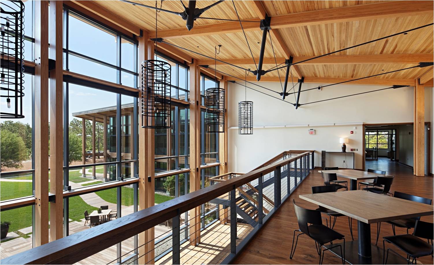
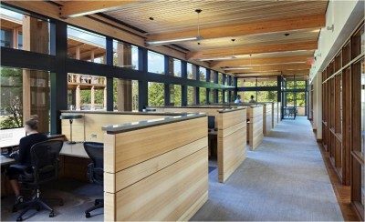 New privately-held bank office building; Customized to Owners specific needs
- Mission: create best workplace environment possible for their employees
- Great lengths taken to preserve trees and natural features of site
- Views from every office and workspace within the building
- Materials chosen to make the structure blend with the environment
- Building anchored by central lounge that includes large kitchen, coffee bar, upholstered casual seating, and two-story window wall overlooking central courtyard and deck
- Two-story office wings radiate to the east with interior glass walls that allow transparency from any point within the building.
- 50-seat tiered digital conference room provides a venue for teleconferencing with satellite offices as well as employee seminars and meetings
- A fitness center, exterior deck, and on-site dog park (employees are encouraged to bring their dogs to work) round out the list of employee amenities
- LEED Project
Best in Show Winner
St. Helena Branch Library
Beaufort County
Liollio Architecture
Angie Brose
Jennifer Charzewski
Jay White
Dinos Liollio
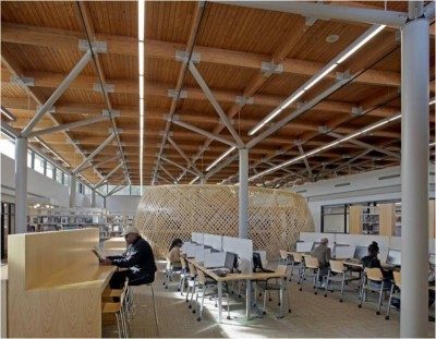 Modern, yet warm, the architecture reflects the unique attributes of Gullah-Geechee Sea Island culture and the vibrancy of the library as a 21st Century gathering place. Prior to design, community workshops were held to gain insight into the context of the GullahGeechee culture. The space was designed to utilize very simple forms and construction methods in order to afford the iconic features that symbolize the shared values of the library and St. Helena community. The Gullah Geechee context is revealed in several aspects of the design, including the woven nautilus of the special collections area located at the heart of the library, suggesting the forms of marine life and traditional net making; raised wood “stomping” floor in the community meeting room that provides the percussion for sea island spirituals; and the “tree” columns reflective of historic images of learning at Penn Center under the massive live oak trees.
Project is pending LEED certification

